

Role
UX Lead
Client
NHS
Team
Me & Visual Designer
Type
Usability & Design
98% of UK citizens think becoming a donor is a good thing. Yet only 30% had registered their choice.
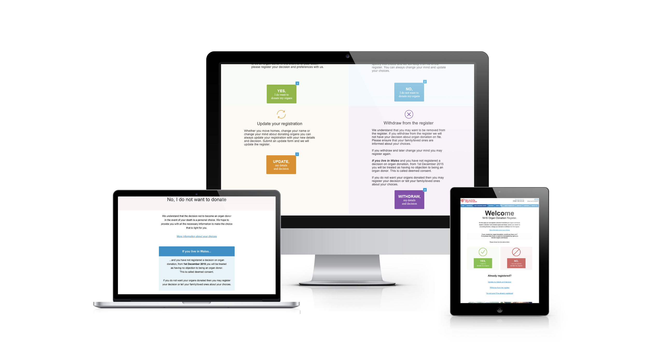
It came down to a simple question, do you want to donate your organs, yes or no. And the entire form system sprang from that initial question.
When I joined the project, the UX lead had suddenly quit, the prototypes were doing miserably in user testing and the client was concerned and trying to control every detail to get things back on track.
I had a 6 hour call with the visual designer discussing everything that was not working. We realized we were too hung up on the complexity of the new opt-in, opt-out laws. When actually, for the user, it’s just a simple question of if they want to donate or not.
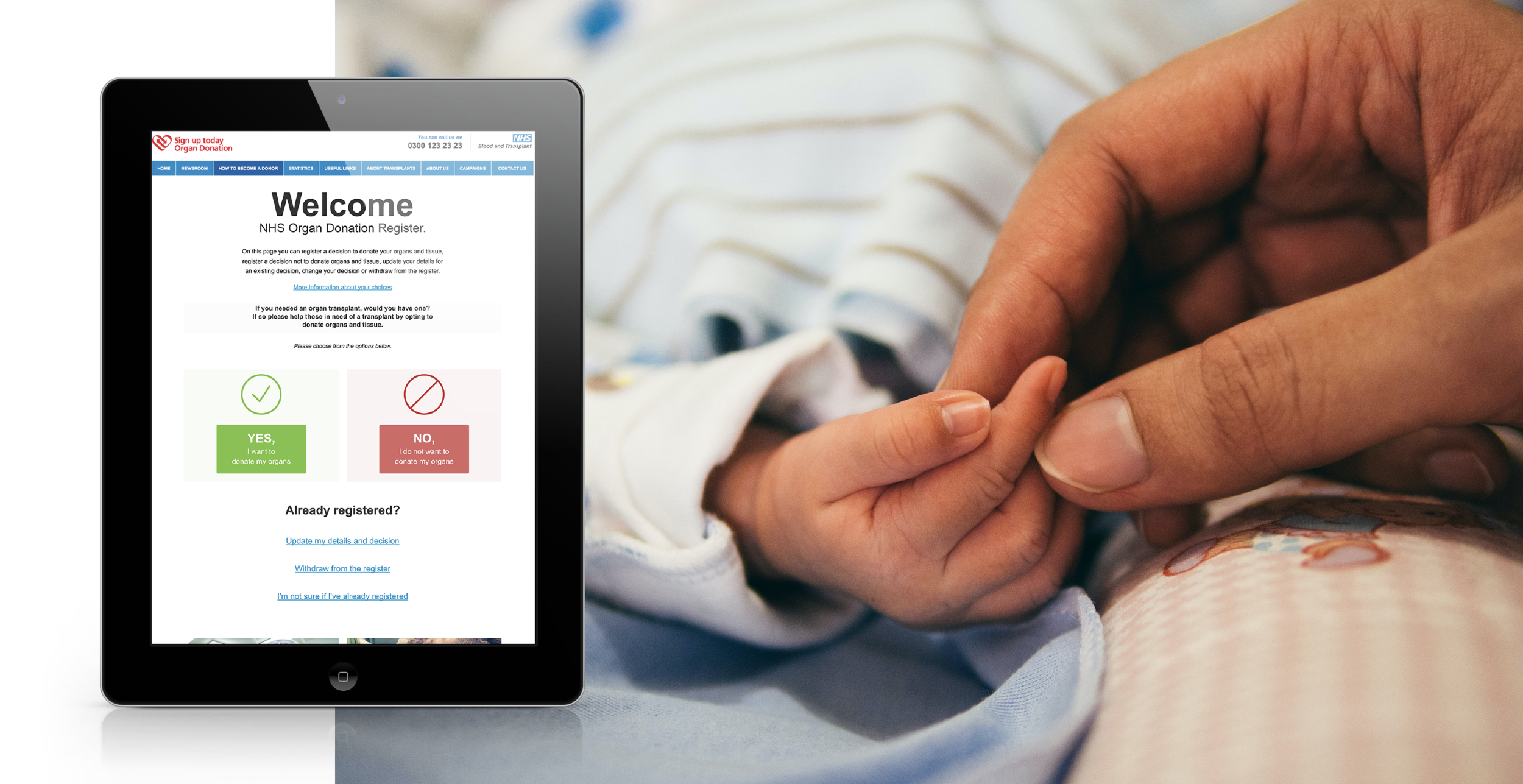
Photo credit to Aditya Romansa
I asked the visual designer how he would do the start page if he had no constraints. What he came back with was so obvious and simple that we knew we were back on track.
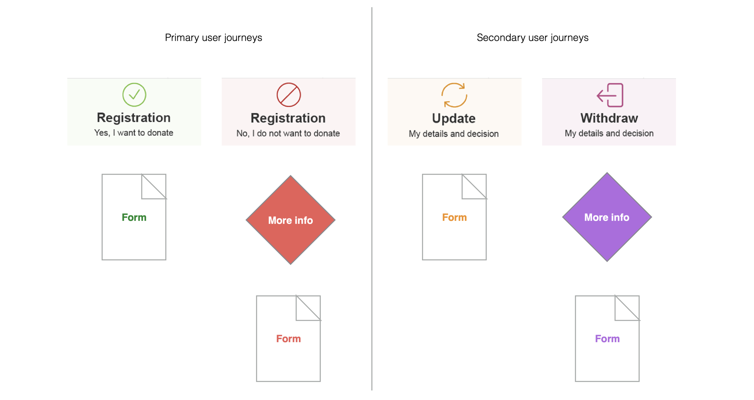
We centered the question on the page and made a clear set of choices. Green for yes, red for no and there were two secondary paths as well for updating information and withdrawing from the registry. I spend my free day prototyping the form system using our new color code and rebuilding the decision tree. When we got back into work we said, we’ve gone and done something completely off track but we think it will test much better.
The client loved it. It made so much more sense in user testing. We immediately rerouted the project to focus on our new structure. Focusing on the user objective first rather than the internal constraints (a separate backend for each country) and legacy complexities (Wales was opt-out but is now opt-in) upleveled the whole project.
We had 100% increase in conversion on Mobile, 50% on Desktop and only 0.2% of visitors chose not to donate.

It has never been easier to register to become an organ donor in the UK than it is now
The site has changed in recent years but the codification and basic structure remain on the NHS Organ Donor Register.